Raaka
Creative Director
Packaging Design
RAAKA is a chocolate company that produces unroasted chocolate bars. RAAKA went through a recent rebrand and I noticed it was missing one of the company’s major components. Their family.
Challenge The assignment required that I re-branding a company that went through a recent rebrand that was visually impactful and would disrupt the shelf space it would occupy.
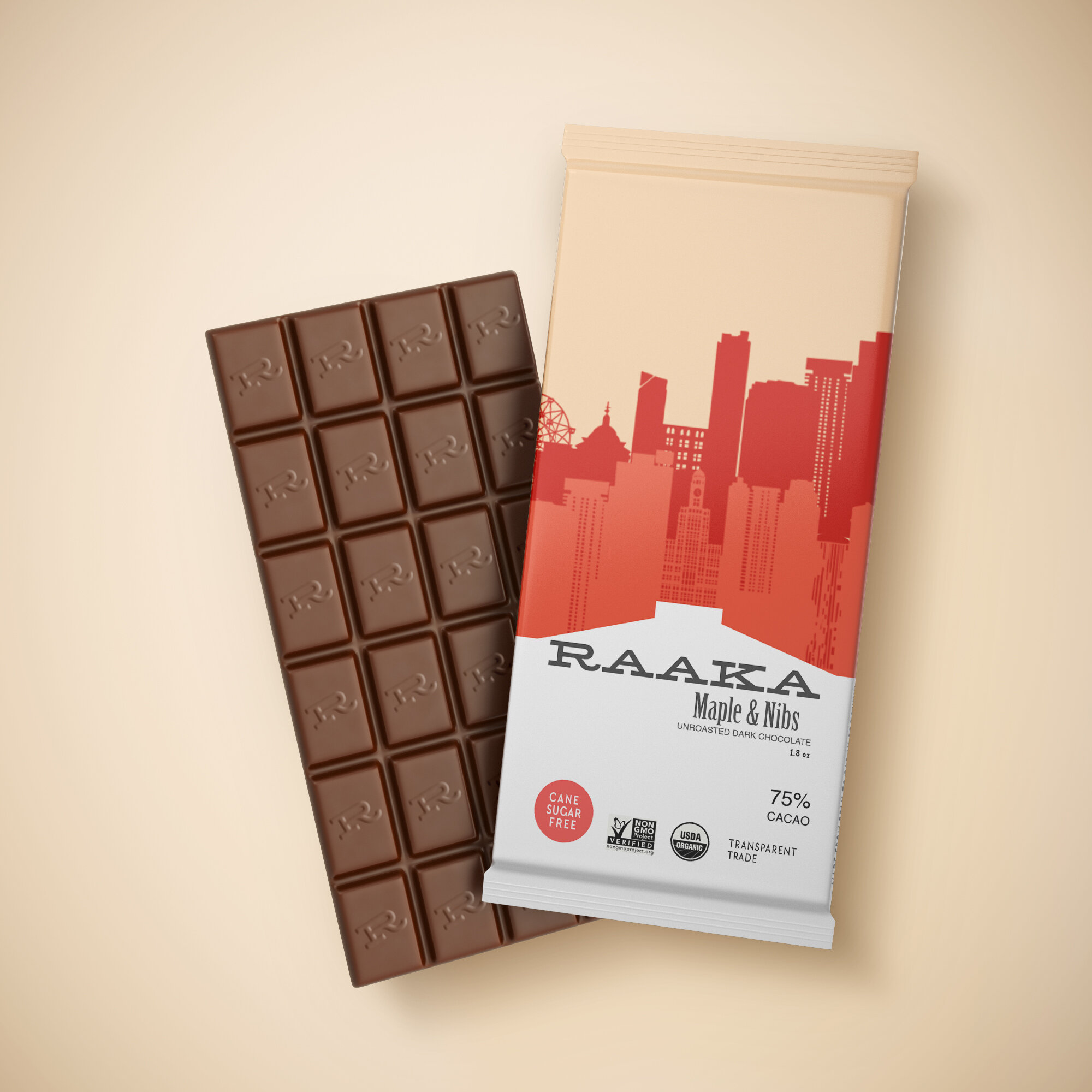
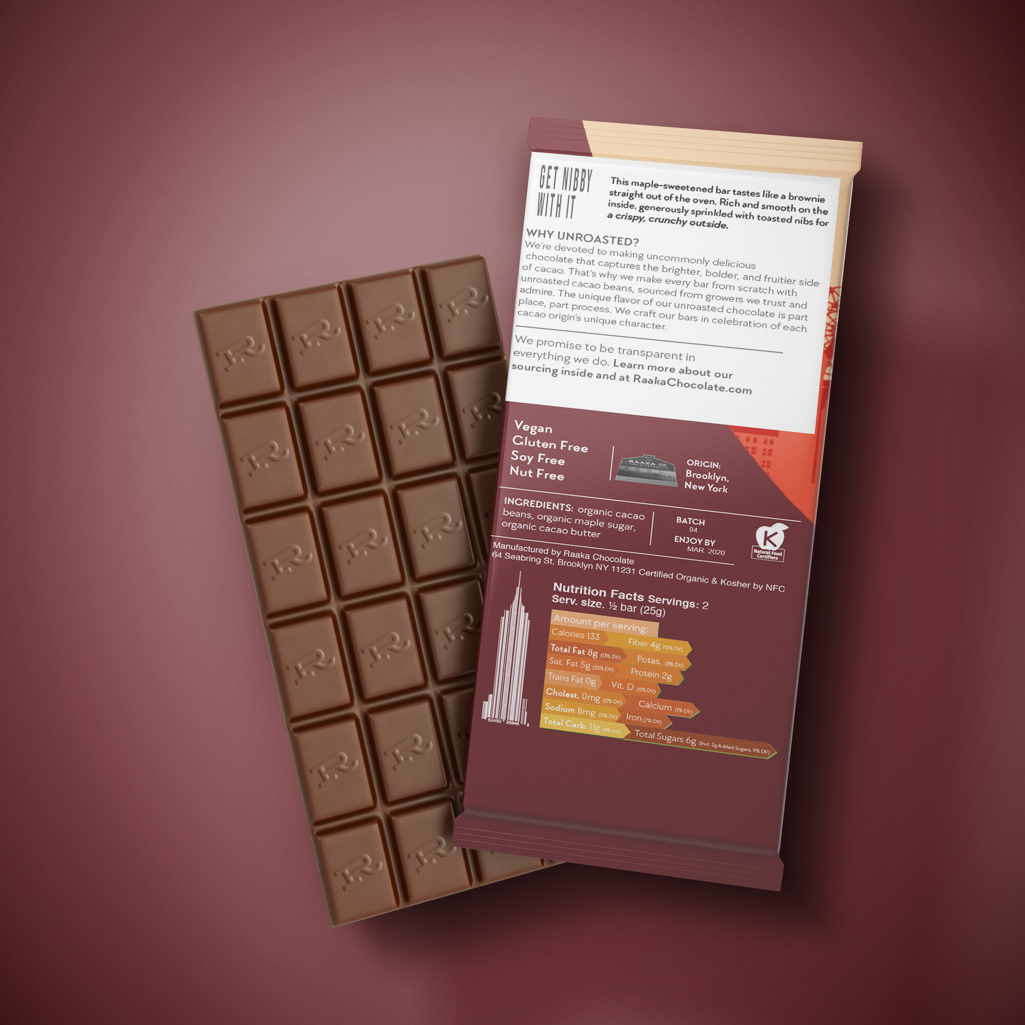
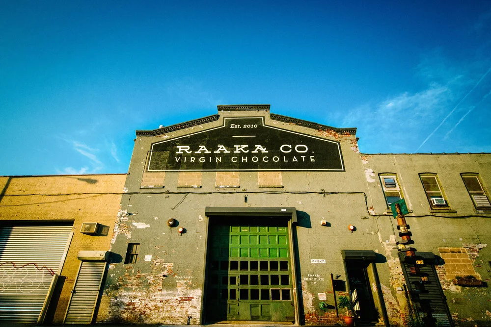
Solution I first researched the company so I would have a baseline to start my design and I discovered the love for Brooklyn (their Headquarters) and decided a skyline of the city would be the best visual representation that could be used in a system. Upon discovering the esthetic I wanted to implement I needed a tagline that would compliment the rebrand, I landed on “Road to Home”. The logo I created was the typeface that is painted on the front of Raaka’s Headquarters.
Fall 2019
Art Direction
Logo Design
Color Palette
Package Design
Branding
About the Company
The word raaka means raw in Finnish. We claim no Finnish heritage, but the cadence of the word and its meaning capture the essence of our chocolate and our process. When we make chocolate we're after something that feels the way Raaka sounds: strong, wild, playful, and most of all, different. We are unserious people who take our chocolate seriously.
We're a strange bunch who all concur on one simple idea: We want to make delicious, creative chocolate that showcases the wilder side of cacao and do so in a way that is as environmentally and socially responsible as we can.
We make all our chocolate in Red Hook, Brooklyn at 64 Seabring Street. Come visit us if you're in town. There are no Oompa Loompas here, but there is plenty of chocolate to try (you cannot swim in it, sorry).